How a participant dashboard can help before, during and after your research
It seems the biggest challenge at the start of every research project is finding the right people to take part and help you answer the research question you've been posed. Sadly this article isn't going to help you with that recruitment challenge but will show you how using a participant dashboard to keep a summary of who you've approached, recruited and who has taken part will help you deliver more robust research, engage your team and create more impactful insights.
So what is a participant dashboard?
It's a bunch of numbers, in a table or visualisation, that is used and updated during a research project. It shows:
who you plan to speak to i.e. user groups and how many participants in each
who you’ve recruited and got booked in
who has taken part in the research
It could be as simple and manual as a whiteboard where you update figures at the end of each day, or as complex as your spreadsheet and data visualisatoin ninja takes you.
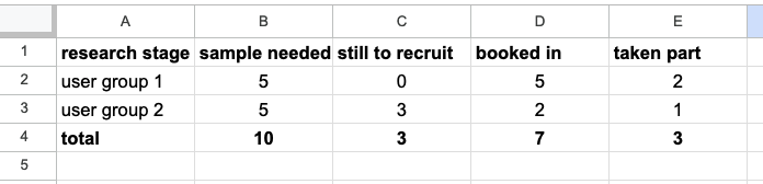
Here's a simple example of a participant dashboard using Google sheets:
Before your research
Helping to identify user group gaps
Every good research project starts with reviewing what's already known and identifying where gaps might lie. Previous research may be piece-meal across different stages of a journey or different user groups, and the research may be reported in different ways.
A review pulls together the summary of insights into a common format, from which you can identify questions that have not been answered. By creating a participant dashboard alongside this, summarising those who have been involved in the research you can identify participants who have not been included or user groups that may have been insufficiently sampled.
In a recent project I was working on, we were redesigning the full journey for users and we needed to have insights from people at all stages along the journey. When I pulled together the dashboard of participants from the earlier research, it was clear to see that most were people who had successfully completed the journey. That highlighted the need to include those still considering, those just starting the journey and those who had got part way through and abandoned the journey.
Helping plan robust research
One element of designing robust research is ensuring you have adequate samples across all your identified user groups. Qualitative user research aims for thematic saturation of findings which allows for lower overall numbers of participants, but it's important to see sample representation across all user groups.
During your research
Keeps your work in the open
Even the simplest of research phases takes several days to recruit and run research sessions. Some teams can be overly keen for answers and fret because they haven't yet seen a research session. Creating a participant dashboard and updating it daily allows your team stakeholders can see your work progress. I have found this also reassures stakeholders who have had poor experiences of research.
Making recruitment challenges clear
Sadly the recruitment of participants rarely runs smooth. Some user groups have lower representation in the population where you are targeting your recruitment, some may be less likely to respond than other groups and sometimes it's just a bad time and no-one has availability when you need them. Obviously this has an impact on running your research so by keeping a participant dashboard up-to-date, the team can see where the challenges lie and come together to generate ideas of how to find and recruit them.
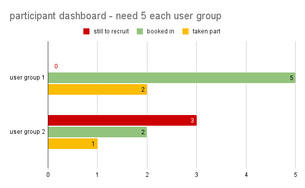
You could use colour coding to highlight issues, for example using traffic light or RAG coding in a visualisation such as shown below:
After your research
Providing clarity for future users of your work
If you include your participant dashboard with your insights it will enable future readers of your research to quickly understand from whom the insights were gained. Don't forget to include the profile descriptions for clarity.
Your future readers can see who you did not include or who you struggled to recruit. This will help them understand how generalisable the insights might be and identify gaps they may be able to fill.
Helping you pass service assessment
For those working the public sector, one of the first questions asked in service assessments is about who has been included in research. Your participant dashboard helps you answer this, and don't forget to include your profile breakdown of users with accessibility needs.
Takeaway
Participant dashboards can be as simple or as complex as you choose or your project demands. They can help across the research life cycle to engage your team, plan your research and deliver robust research for your project and those who explore it later.
In a later article I'll show you how you can link participant dashboards to other parts of your recruitment process such as your database of potential participants and incoming data from your screener. I'd love to hear how others use dashboards and how they have helped your research.